Stories that Celebrate

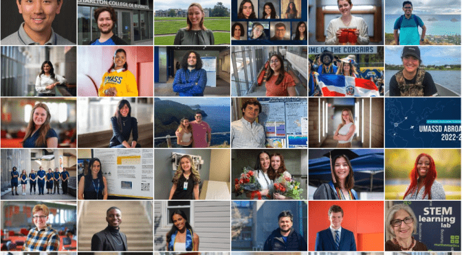
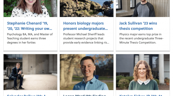
Throughout the 2022-23 Academic Year, the Communications team put a strong focus on telling the story of UMassD from those who can share it best – our students. 

From following students studying abroad and highlighting local internship success to covering students stepping out of the classroom to make an impact in their community (and doing pretty amazing things like attending the SOTU!), the Comms team had it covered. 

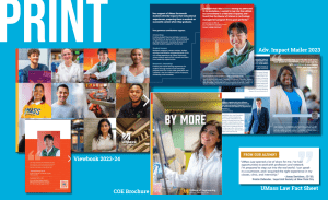
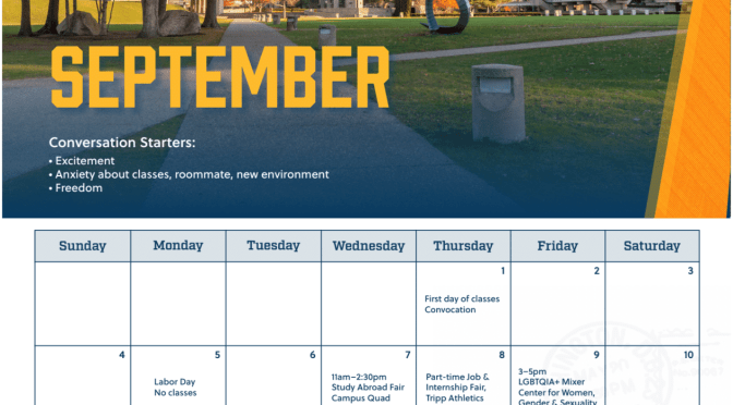
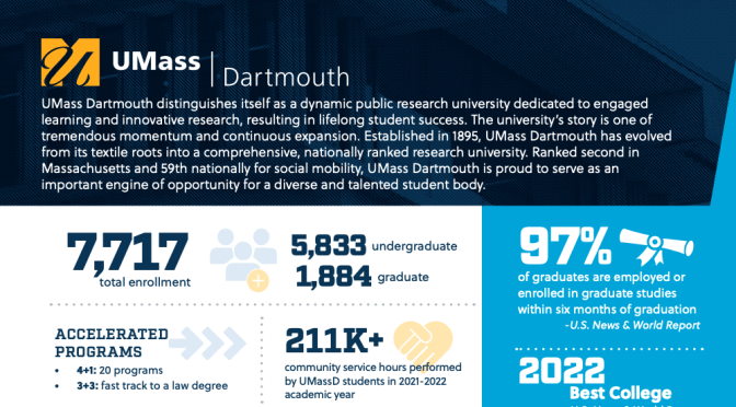
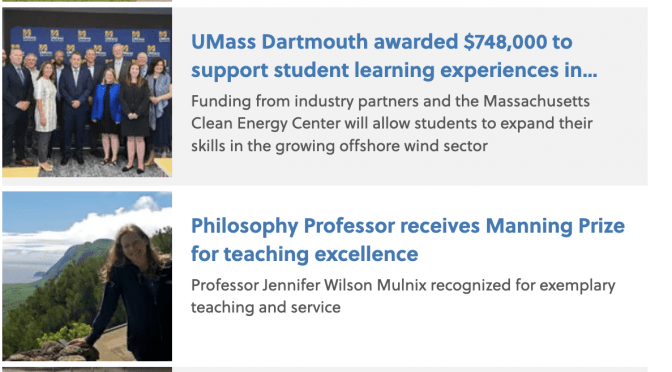
There’s a lot that happens after we click “publish” on a story. See below for just a few examples of where our stories end up (with the help of our marketing colleagues) – print pieces, social media, video, digital ads and more!  

Featured stories:
Ramina Behzad ’25: Turning her passion into life-changing
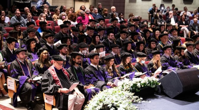
Janay Davidson, JD ’23: Ready for work as a New York City public defender
Kenny Duong, ’23, ’24: Becoming a leader 

For more from our Communications Specialists, Debra Hazian,  Kelsey Healey and David James, visit our website.

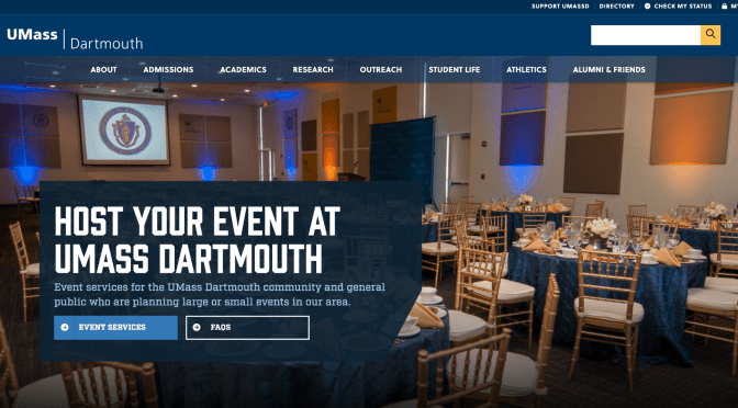
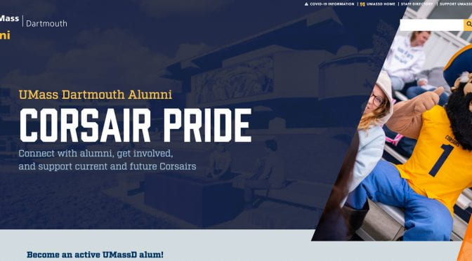
umassd.edu redesign

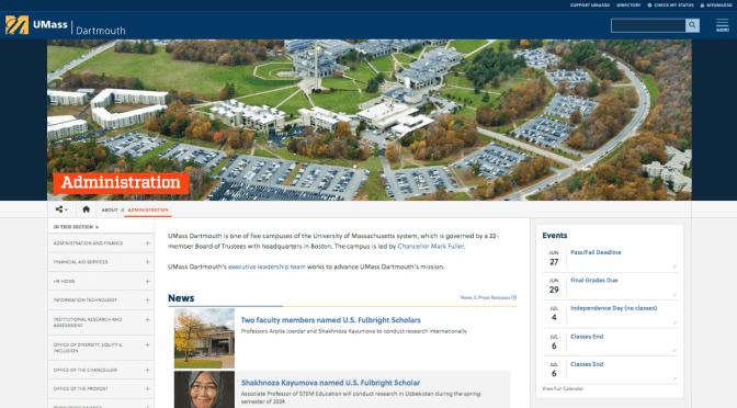
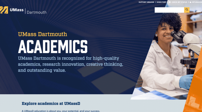
University Marketing launched a redesign of the umassd.edu website.
Features:
  1. improved way-finding: incorporate dropdown navigation when child sections present in left navigation menu
  2. widen the site, incorporating gutters and grays for improved display on larger screens
  3. increasing size and readability of imagery and right column items like RFI forms, buttons
  4. condense user controls in order to lift site content as high on page as possible
  5. condensed user controls allow for more explicit calls to action (Tweet this page) and flexibility to add more functionality
  6. redesign the hero image incorporating more brand visual elements as well as giving the image more visual impact
  7. placing page title within content area to better associate title to content

Academic Calendar Redesign

University Marketing partnered with Online & Continuing Education and the Registrar’s Office to integrate their Academic Calendars into a single user experience.

https://www.umassd.edu/academiccalendar/

Features

  • a single, consistent user-experience
  • semesters and sessions compiled
  • leveraging the university events calendar to maintain their dates
  • the ability to display the data across umassd.edu

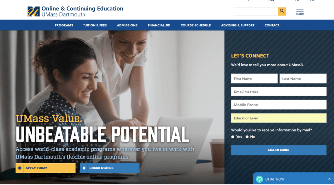
Online & Continuing Education homepage redesign

University Marketing launches redesign of of Online & Continuing Education homepage:

https://www.umassd.edu/online/

Features

  • Prominent, embedded inquiry form to more easily capture inquiries more efficiently
  • Program finder to allow users to browse online program offerings in fewer clicks
  • Feeding in information session events from CRM directly onto home to allow for faster browsing of what’s available in fewer clicks


Marketing redesign

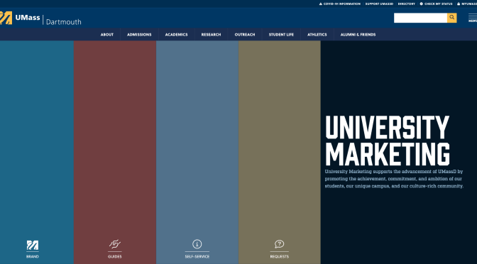
In an effort to better serve the UMassD campus community, University Marketing has launched a redesign of their website.

https://www.umassd.edu/marketing/

Features

  • improved visual interface
  • reorganization of our guides and self service offerings

Looking ahead

University Marketing will continue to evaluate and roll-out improvements based on your feedback. Some items we are actively working on or will be in the months ahead:

  • improvement and simplification of intake process
  • redesigning brand guidelines into a user-friendly web experience

Web content styling

Did you know that our web team has formatted the UMass Dartmouth website for the best user experience possible?  In addition to readability and visual aesthetic, the web team considers those with accessibility issues when designing all aspects of the website.  This allows you, our content contributors, to focus on gathering and posting great content for your readers!

A few tips when entering in content for your site visitors:

  • Do not use extra returns for additional spacing between lines and/or paragraphs. Th website typography is coded for consistent spacing to ensure optimal legibility and consistency across all university pages.
  • Please limit the use of italics to names of books, films, journals, etc., as too many italicized words can often be difficult to read.
  • Separate content through the use of headings.  This is more accessible and more search-engine friendly, which helps more visitors finds your site!
  • When adding images, please use the Blue “Select Media” button, rather than inserting it into the html editor.  Selecting images through the Media library in this manner allows the images on the University’s site to be responsive, no matter what size screen our viewer uses (where inserting from the html editor can cause formatting issues).

Add media using the blue "Add media" button

  • Additionally, please try to refrain from using images-as-text to convey information.  For our users that need screen-readers, these images aren’t accessible, and these users will not be able to receive that information.  To read more on that subject, you can go to our guide on Images Best Practices and see the “text-as-image” accordion .

For additional UMassD formatting tips and resources, you can refer to the University Marketing’s Guide to Web Writing, and our T4 User Guide, specifically our Editing & Saving Content section.

Note: Please keep in mind that the HTML editor will display typography different from the published site.  You can preview your page before publishing to see how it will look on the live site. See previewing your content in the editing content guide.
Thank you for helping keep our site updated and user-friendly!!